Getting Started with Textile Pattern Design
Textile pattern design is where art meets engineering. Unlike graphic design or illustration, your designs must work within the constraints of fabric printing, repeat seamlessly, and look good both on screen and on actual fabric. Whether you're a fashion design student, a hobbyist, or transitioning from another creative field, these ten tips will set you on the right path.
1. Start with Observation
Before opening any design software, train your eye by studying existing textiles. Visit fabric stores, collect swatches, and analyze patterns you admire. Ask yourself: How large is the repeat? How many colors are used? Is it a block repeat or half-drop? What makes this pattern work on fabric as opposed to paper or screen?
Take photos of patterns in the real world — on clothing, upholstery, curtains, and rugs. Build a reference library organized by style (floral, geometric, abstract, conversational) and technique (screen print, digital, woven, embroidered).
2. Understand Scale and Context
A pattern that looks stunning on your monitor may look entirely different on actual fabric. Screen pixels are tiny; fabric print dots are relatively large. A delicate line that's 1 pixel wide on screen might disappear completely in print, or conversely, a pattern that feels bold on screen might look subtle at 1:1 scale on a bedsheet.
Always design at actual print size (100% scale, correct DPI) and periodically zoom out to see the overall effect. Better yet, print a test swatch early in your process.
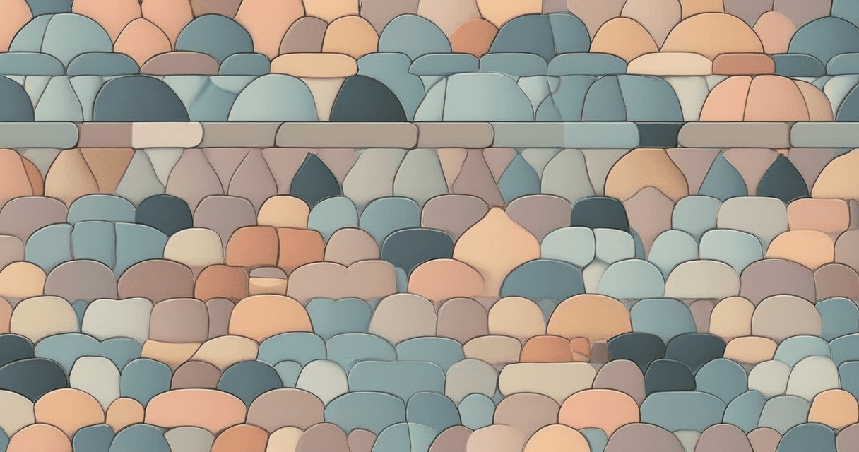
3. Master the Art of Repeat
The repeat is the fundamental unit of textile pattern design. A pattern that doesn't repeat seamlessly is unusable in production. Start by mastering simple block repeats, then progress to half-drop and half-brick layouts.
Common beginner mistake: designing a beautiful motif but neglecting the edges. The magic of a great pattern happens at the tile boundaries. Spend as much time refining the edges as you do on the central motif.
4. Limit Your Color Palette
Beginners often use too many colors. Professional textile patterns typically use 3-8 colors. Fewer colors mean:
- Lower production costs (fewer screens or ink changes)
- Easier color matching to Pantone standards
- Stronger visual impact (constraint breeds creativity)
- More versatile designs that work across different colorways
Start with a 3-4 color palette and add colors only when absolutely necessary. You'll be surprised how much you can achieve with restraint.
5. Design in Colorways
One pattern design should yield multiple colorways — the same motif and layout in different color combinations. This is standard practice in the textile industry and dramatically increases the commercial value of your work.
Design your initial pattern, then create 3-5 color variations targeting different moods: a bright version, a muted/earthy version, a monochrome version, and perhaps a seasonal palette. A single geometric pattern in 5 colorways is 5 products from one design effort.
6. Learn About Printing Methods
Your design must be producible. Understanding how fabric is actually printed will prevent you from designing things that look great on screen but are impossible or prohibitively expensive to produce.
Key constraints to understand:
- Screen printing: limited colors (typically 8-16), repeat constrained by cylinder size
- Digital printing: unlimited colors, but certain Pantone shades can't be matched in CMYK
- Both methods: minimum line thickness (~0.3mm), trapping requirements between adjacent colors
7. Build a Motif Library
Professional designers maintain libraries of motifs — individual design elements like flowers, leaves, geometric shapes, and abstract marks. These building blocks can be combined, resized, rotated, and recolored to create new patterns quickly.
Develop your own signature motifs rather than relying on stock elements. Hand-drawn elements scanned at high resolution add an authentic, artisanal quality that distinguishes your work from purely digital designs.
8. Pay Attention to Negative Space
The space between motifs is as important as the motifs themselves. Dense, busy patterns can feel overwhelming and are harder to produce cleanly. Strategic negative space gives the eye a place to rest and makes the main motifs more impactful.
Look at your pattern from a distance. If it looks like an undifferentiated mass of color, you probably need more breathing room. If it looks sparse and disconnected, your motifs may need to be larger or more tightly arranged.
9. Always Work Non-Destructively
Keep your layers organized and your original elements editable. You'll need to make adjustments — change colors, resize motifs, adjust spacing — many times before finalizing a design. If you've flattened everything into a single layer, these changes become painful or impossible.
Use a consistent file naming convention: PatternName_v01_Colorway-A.tiff. Save versions, not overwrites. The design you "finished" yesterday often needs tweaking after a fresh look tomorrow.
10. Get Your Files Production-Ready
The final step — and one often overlooked by beginners — is preparing files for actual production:
- Resolution: 150-300 DPI at actual print size (not screen resolution)
- Color mode: Spot colors specified to Pantone TCX for screen printing; RGB or CMYK with embedded profiles for digital printing
- Format: TIFF (lossless) for production files; avoid JPEG compression which degrades quality
- Repeat verification: Test your pattern in a 3x3 grid to confirm seamless tiling
- Color specification: Include a technical spec sheet with Pantone codes, repeat dimensions, and print method notes
Start Creating Today
Textile pattern design is a skill that improves with practice. Don't wait until you've mastered every concept — start designing now, learn from each attempt, and gradually refine your technique. Modern AI-powered tools can handle much of the technical heavy lifting (seamless repeats, color matching, upscaling), freeing you to focus on the creative aspects of design.
The textile industry is always looking for fresh perspectives and unique design voices. Your next pattern could end up on fabric sold in stores worldwide.