Texloom
Pricing
Sign in
Launch Studio

Stay in the loop

Get textile design tips and product updates delivered to your inbox.

Texloom

AI-powered textile design platform. Create seamless patterns, separate colors, and export production-ready files.

Product

  • All Tools
  • Seamless Pattern Maker
  • Color Separation
  • AI Pattern Generator
  • Pantone Matching
  • Textile Printing Software
  • Pricing

Industries

  • Fashion Design
  • Home Textiles
  • Screen Printing
  • Digital Printing
  • Apparel Manufacturing

Resources

  • Free Tools
  • AI Image Upscaler
  • Blog
  • Learn
  • Changelog
  • Roadmap
  • About
  • Editorial Standards
  • FAQ
  • Sitemap

Legal

  • SLA
  • Status
  • Acceptable Use
  • Privacy Policy
  • Terms of Service
  • Refund Policy
  • Cookie Policy
  • Design Security
  • Contact

Compare

  • Texloom vs Photoshop
  • Texloom vs Midjourney
  • Texloom vs NedGraphics
  • Texloom vs PatternedAI
  • Texloom vs Kaledo

© 2026 Texloom Studio. All rights reserved.

Your designs are private — never shared, never used for AI training
SitemapAll systems operational
Blog
How to Extract a Color Palette from Any ...
TutorialMay 24, 20264 min read· Updated April 25, 2026

How to Extract a Color Palette from Any Image (Textile)

Prince Ramgarhia

Texloom Studio

Share
How to Extract a Color Palette from Any Image (Textile)

Key Takeaways

  • •Use K-means clustering in LAB space, not RGB — LAB matches human perception of color similarity.
  • •Extract 5–8 dominant colors maximum; more than 8 produces a cluttered, unusable palette.
  • •Always ignore near-white and near-black pixels during clustering — they dominate the average without contributing useful palette information.
  • •Map each extracted color to the nearest Pantone TCX using CIEDE2000, not RGB Euclidean distance.
  • •Test the palette on the actual fabric substrate — extracted colors rarely print exactly as screen-previewed.

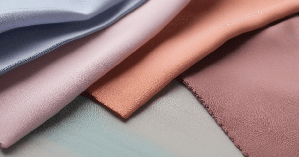
Every textile designer builds palettes from inspiration images — fashion photography, fabric swatches, nature shots, mood boards. Done manually with the eyedropper tool, this takes 20 minutes and produces inconsistent results. Done correctly with K-means clustering in LAB space, it takes 30 seconds and produces a palette that genuinely represents the source.

This guide covers the math behind proper palette extraction, the Pantone TCX mapping step that makes extracted colors production-ready, and the five mistakes that produce unusable palettes.

Why K-Means Clustering Wins

K-means is a clustering algorithm that groups pixels into K color groups (K = number of palette colors you want). Each cluster's center is one palette color. The algorithm:

  1. Start with K random color seeds in color space
  2. Assign every pixel to its nearest seed
  3. Move each seed to the average of its assigned pixels
  4. Repeat until seeds stop moving

The result: K colors that collectively best represent the image. Unlike manual eyedropper sampling, K-means finds actual color clusters rather than single pixel samples, so the palette reflects dominant trends rather than one designer's arbitrary picks.

The LAB Space Requirement

Running K-means in RGB is fast but produces perceptually wrong results. RGB Euclidean distance over-weights blue-green differences and under-weights neutral differences. Two pixels 20 units apart in RGB might look identical (if in dark neutrals) or dramatically different (if in saturated cyans).

LAB space fixes this. Equal distance in LAB equals equal perceived difference, because LAB is designed around human visual perception. K-means clustering in LAB groups pixels by how similar they actually look, not by their raw numeric similarity.

Every professional palette extraction runs in LAB. Tools that don't — including many free web-based extractors — produce palettes that look wrong for reasons users cannot quite articulate.

Extraction Workflow

  1. Load the source image. Ideally at original resolution; downsampling to 512×512 for clustering is fine and 10× faster.
  2. Convert to LAB color space. Every professional tool does this automatically.
  3. Filter out extreme lightness. Mask pixels with L < 10 (near-black) and L > 95 (near-white). These dominate averages without contributing useful palette info.
  4. Run K-means with K = 5 to 8. Lower for minimal palettes, higher for rich multi-color designs.
  5. Sort by dominance. Output palette ordered by cluster size (biggest cluster = most dominant color).

Pantone TCX Mapping

Extracted palette colors are arbitrary LAB values. For textile production, they need to map to specific Pantone TCX references (or approved CMYK builds). The mapping workflow:

  1. For each extracted color, calculate CIEDE2000 Delta E against every Pantone TCX library entry
  2. Take the lowest Delta E as the nearest match
  3. If Delta E ≤ 2, the match is commercially acceptable
  4. If Delta E 2–4, the match is close but may need spot-ink adjustment
  5. If Delta E > 4, no close Pantone exists — decide: accept CMYK reproduction, or specify custom spot ink

Our Color Matching tool runs K-means in LAB, filters extremes, and does Pantone TCX mapping in one pass, reporting Delta E for every match.

Common Extraction Mistakes

  • Running K-means in RGB. Wrong color space, wrong distance metric, wrong results.
  • Not filtering white and black. Palette becomes "white, black, gray, one real color."
  • Extracting too many colors. 12-color palettes are unusable for most textile applications.
  • Relying on image-compression artifacts. Heavily compressed JPGs have color noise that becomes cluster members.
  • Skipping substrate testing. Extracted colors look different on cotton vs polyester vs silk.

Refining the Extracted Palette

Raw K-means output is the starting point, not the final palette. Typical refinement:

  • Adjust saturation uniformly for a cohesive look
  • Lighten or darken one accent color for visual hierarchy
  • Replace one machine-selected color with a designer-chosen alternative
  • Confirm final palette works across all intended substrates

The algorithm gets you to a defensible starting palette fast. The designer turns it into something production-ready.

Applications in Textile Workflow

  • Season palette development — extract from trend mood boards, convert to Pantone, release to design team
  • Brand color auditing — extract from existing brand photography, compare to stated brand colors, find drift
  • Fabric photograph matching — scan a vintage fabric, extract palette, recreate for new production
  • Colorway generation — one pattern, multiple palettes extracted from different source images

Related Reading

For the color-transfer step that applies an extracted palette to an existing design: Reinhard color transfer guide. For the Delta E tolerances that determine whether a Pantone mapping is acceptable: CIEDE2000 Delta E explained. For the complete color management framework: textile color management playbook.

Frequently Asked Questions

Q.How many colors should a textile palette have?
5–8 dominant colors is the sweet spot for most textile applications. Fewer (3–4) works for minimal palettes but limits design range. More than 8 produces clutter and inflates print setup costs for screen printing (every color = one more screen). For commercial textile collections, plan 5–6 colors that can be combined in multiple patterns.
Q.Why use K-means clustering in LAB space instead of RGB?
RGB Euclidean distance does not match human perception — two colors 10 units apart in RGB can look very different depending on whether the change is in the dark-blue or light-yellow region. LAB is perceptually uniform: equal distance in LAB equals equal perceived difference. K-means clustering in LAB produces palettes that match how designers actually see the source image.
Q.Should I ignore white and black pixels when extracting a palette?
Yes, almost always. Most images have large areas of near-white (backgrounds, highlights) or near-black (shadows) that would dominate a pure K-means clustering, giving you a 'palette' of white + black + one actual color. Mask out pixels below L=10 and above L=95 before clustering to force the algorithm to find real color information.
Q.How do I convert extracted palette colors to Pantone TCX?
For each extracted color in LAB space, calculate CIEDE2000 Delta E against every color in the Pantone TCX library. The nearest match (lowest Delta E) is your Pantone mapping. Typical extraction produces Delta E 1–3 matches for most colors; Delta E above 4 means the extracted color has no close Pantone equivalent and may need either CMYK reproduction or a custom spot-ink match.
Q.Can I extract a palette from any image?
Technically yes, in practice some images produce better palettes. Good sources: clean fabric swatches, well-lit fashion photos, carefully edited mood boards. Poor sources: cluttered multi-subject photos, heavily compressed images, screenshots with overlaid UI elements. If the source image has 50 distinct colors with no clear dominance, the extracted palette will be arbitrary.

Prince Ramgarhia

Founder, Texloom Studio

Prince Ramgarhia is the founder of Texloom Studio. He has spent years working alongside textile designers, print shops, and garment manufacturers — diagnosing why files fail on press and building the tools to fix them before they hit the fabric.

LinkedIn
#color palette#color extraction#K-means#Pantone TCX#textile color#mood board

On this page

  • Why K-Means Clustering Wins
  • The LAB Space Requirement
  • Extraction Workflow
  • Pantone TCX Mapping
  • Common Extraction Mistakes
  • Refining the Extracted Palette
  • Applications in Textile Workflow
  • Related Reading
Back to all articles

Ready to Try These Techniques?

Put what you've learned into practice with Texloom's AI-powered textile design tools.

Try Texloom Studio

Related Articles

How to Vectorize a Hand Drawing for Rotary Screen Printing
Tutorial

How to Vectorize a Hand Drawing for Rotary Screen Printing

How to Check If Your Pattern Actually Tiles (Before Printing)
Tutorial

How to Check If Your Pattern Actually Tiles (Before Printing)