If you have ever sent a design to a printer and received back a sample with muddy colors, soft edges, or a seam running down the middle of every meter — this guide exists to stop that from happening again.
Preparing artwork for textile printing is not the same as preparing artwork for screen, billboard, or even paper. Fabric absorbs ink differently, repeats behave differently, and the tolerance for error is smaller because a reprint eats a bolt of fabric, not a ream of paper. This guide covers the four things every production-ready textile file needs to get right: resolution, color, format, and repeat geometry.
Everything below is written from a production-floor perspective, not a tutorial-video one. Real numbers, real file specs, real failure modes.
1. Resolution: Why 300 DPI Is a Meaningless Number Until You Add Size
Every beginner has heard "print at 300 DPI." Very few have been told the follow-up: 300 DPI at what dimensions?
A file saved at 300 DPI with a canvas of 10cm×10cm is a 1,181×1,181 pixel image. The same 300 DPI at 100cm×100cm is 11,811×11,811 pixels — 100 times more data. If you design at the first size and the client wants the second, you cannot rescue the detail. You are interpolating pixels that were never captured.
The rule that works in production:
- Digital textile printing (DTF, DTG, sublimation): 300 DPI at the final printed dimensions
- Rotary screen printing: 360 DPI at final dimensions (because screen ruling varies from 40–120 LPI)
- Flat screen / hand screen: 150–200 DPI is typically sufficient
- Banners, flags, outdoor: 150 DPI at final size, since viewing distance is greater
If you inherit a low-resolution file, you have two options: ask the client for a higher-resolution source, or use an AI-based upscaler designed for fabric textures. Generic photo upscalers smooth skin and grass; textile upscalers preserve the weave, thread structure, and pattern edges that matter in fashion and home furnishing.
For a deeper breakdown of DPI by printing method, see our follow-up guide on what DPI fabric prints actually need.
2. Color: CMYK, Pantone TCX, and Why sRGB Will Betray You
Your screen shows color in sRGB. Your printer prints in CMYK inks or spot Pantone TCX dyes. These are different color spaces, and they do not overlap completely. Submitting an sRGB file and expecting the print to match your monitor is the most common root cause of "the colors came out wrong."
Here is what each color space is actually for:
- sRGB — screens and web only. Never the final submission format for textile.
- Adobe RGB — wider gamut than sRGB, useful for photography workflows, but still screen-space.
- CMYK (Fogra39) — the industry default for digital four-color textile processes. Embed the ICC profile.
- Pantone TCX — the textile cotton standard. Use these when specifying exact colors for screen printing, woven labels, or brand-critical shades.
A practical workflow: design in Adobe RGB or a wide-gamut working space, then soft-proof to CMYK before submission. If your design uses brand-critical colors (a specific navy, a specific red), specify them in Pantone TCX codes in a text layer or on a separate reference sheet. Do not rely on the printer to interpret "warm navy."
To match existing swatches or brand colors from an inspiration image, the fastest workflow is to extract the dominant palette and convert each swatch to the nearest Pantone TCX value using a proper LAB-space distance metric — CIEDE2000, not RGB Euclidean distance.
3. File Format: The Short List of What Printers Actually Accept
Production shops do not want to guess at your file. They want one of these, in this order of preference:
- TIFF, flattened, LZW-compressed, 8-bit or 16-bit — universal standard. Every RIP accepts it. Use this unless the printer specifies otherwise.
- PSD, flattened — works if the printer uses an Adobe-native workflow.
- PDF — best for designs with vector elements (logos, labels, text). Preserve vectors; do not rasterize.
- JPG — last resort only. JPEG's lossy compression shows as visible banding on large solid fabric areas.
- PNG — avoid for final submission. PNG does not support CMYK, which means the printer has to convert, which means unintended color shifts.
A note on AI tool outputs: most AI image generators output PNG or web-optimized JPG. Treat these as working files, not submission files. Convert to TIFF with an embedded profile before handing off. If you need to convert between formats while preserving the color space, a dedicated format converter is far safer than "Save As."
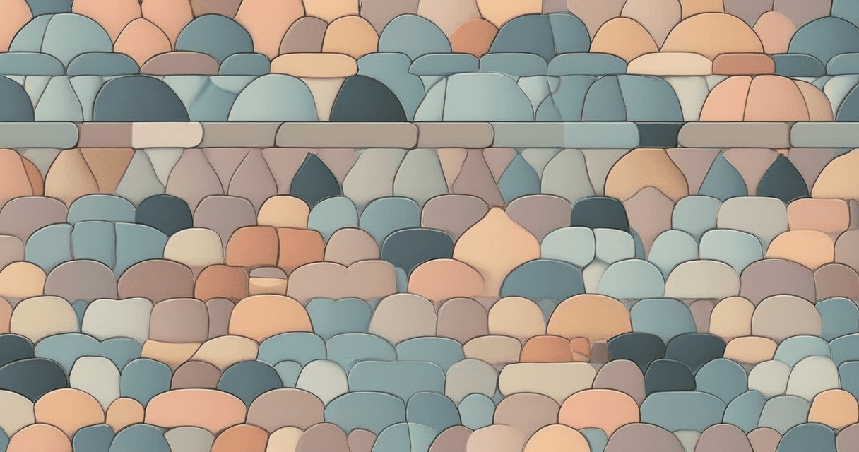
4. Repeat Geometry: The Seam That Ruins 500 Meters of Fabric
For any design that tiles — repeat patterns, all-over prints, dress fabrics, bedding, wallpaper — the single most expensive mistake is a broken seam. A misalignment invisible at 10cm becomes a visible stripe running the length of the bolt.
Three checks before any tileable design goes to production:
- Visual 3×3 grid preview. Tile the design in a 3×3 grid and look for obvious edge lines, motif crashes at the corners, or "grid striping" where eye-catching elements form visible horizontal or vertical bands.
- Seam energy measurement. Run a tool that computes pixel-level difference across the tile boundary — a true seamless repeat has near-zero edge energy.
- Scale test print. Print at 1-meter scale on paper before committing to fabric. Many seam failures are invisible at A4 scale and glaringly obvious at 1 meter.
Choose the right repeat type for the garment: straight (simple but can look gridded), half-drop (the most common for textiles, hides seams well), half-brick (horizontal offset, good for masonry-like patterns). The choice changes how the motif needs to be constructed, not just how it tiles.
5. Bleed, Registration Marks, and the Boring Things That Save You
Bleed is the extension of your design past the cutline so that small cutting inaccuracies do not leave a white edge. How much bleed depends on the process:
- Cut-and-sew garments: 3–5mm on every edge
- Banners and soft signage: 10–15mm
- Rotary screen: one full vertical repeat of bleed in the screen direction
Also include: crop marks (if the printer requests them), a filename + design code + date in a non-printing layer, and color bars in the bleed area for press calibration on longer runs.
The Pre-Submission Checklist
Before sending any textile file, confirm every item on this list:
- ✓ Resolution is 300 DPI (or process-appropriate) at the final printed size
- ✓ Color mode is CMYK with Fogra39 embedded, or spot Pantone TCX
- ✓ File is TIFF (flattened, LZW) or printer-approved alternative
- ✓ For tileable designs: 3×3 grid verified, seam energy checked, scale test printed
- ✓ Bleed added per process requirement
- ✓ ICC profile embedded, not stripped
- ✓ File size sanity-checked (typical: 20MB–400MB for textile artwork)
- ✓ Filename includes design code, date, and version
Every failed reprint I have seen in production traces back to skipping one of these.
What to Read Next
This pillar links to the detailed guides in our textile print-preparation series:
- How to Fix Blurry Designs Before Printing
- What DPI Should Fabric Prints Be (Digital vs Rotary vs Screen)
- The Complete Seamless Pattern Design Workflow
- Pantone TCX Color Matching for Textile Design
Each covers one stage of the prep pipeline in enough depth that a designer new to textile production can follow from blank canvas to print-ready file without guessing.