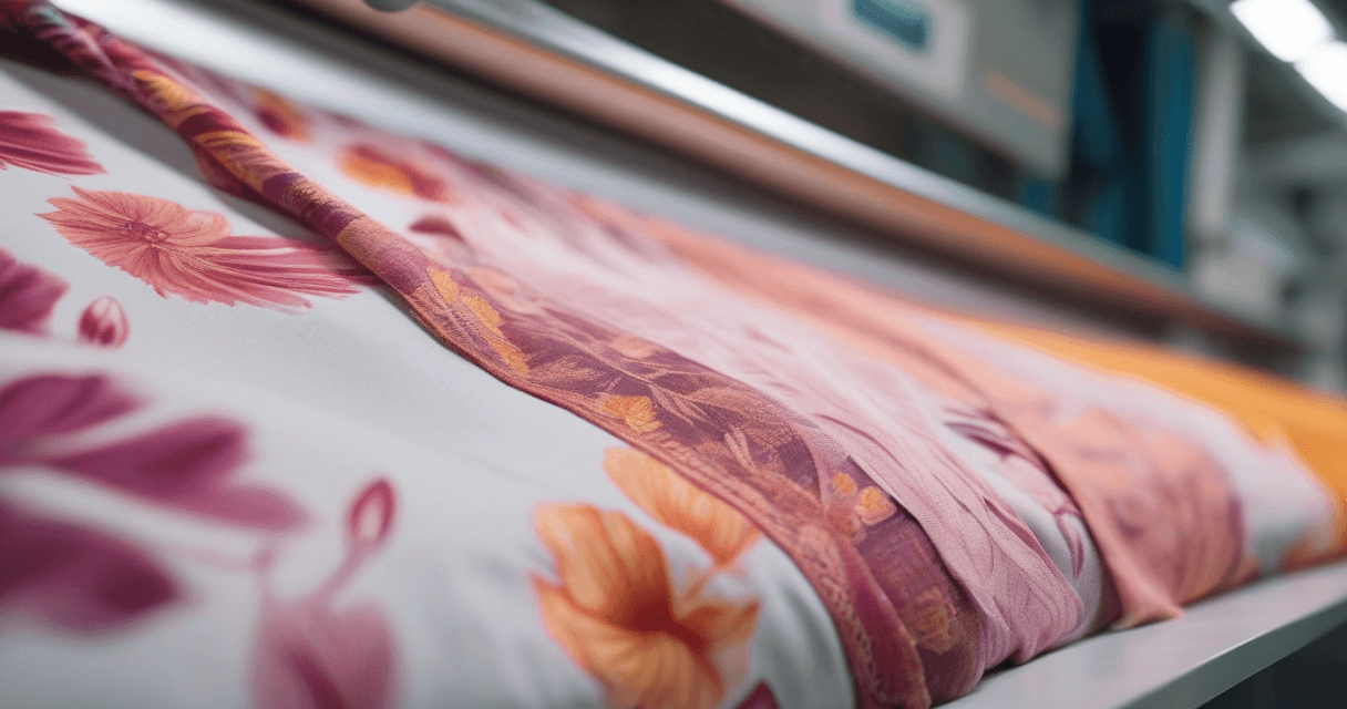
Digital batik, ikat and shibori used to mean either learning the physical craft or spending days hand-painting crackle and blur in a raster editor. AI style transfer collapses that into minutes: you feed it clean artwork, pick the resist tradition you want, and the model applies the wax crackle, the yarn feathering or the fold-and-bind geometry for you. This guide shows how to get results that read as genuinely hand-dyed rather than a filter dropped on top.
Before you touch any tool, it helps to understand what each technique actually is, because the AI is imitating a physical process. Get the mental model right and your prompts, references and strength settings all fall into place.
Three resist traditions, three different looks
All three belong to the family of resist dyeing, where part of the cloth is protected so it stays undyed. But the resist is created in completely different ways, and that difference is exactly what your eye reads.
| Technique | How the resist is made | Visual signature to aim for |
|---|---|---|
| Batik | Hot wax drawn with a canting tool or stamped with a copper cap, then dyed | Fine line work, layered dye bleeds, and the classic crackle where wax fractures |
| Ikat | Yarns are bound and dyed before weaving, then woven | Soft, feathered blur along motif edges where warp and weft shift out of register |
| Shibori | Cloth is folded, bound, clamped or stitched before dipping | Repeating geometric or organic marks with a halo of graduated color |
The single most useful distinction: batik and shibori dye finished cloth, while ikat dyes the yarn first. That is why ikat always looks slightly out of focus at the edges, and why forcing crisp edges is the fastest way to make it look fake.
It helps to picture the physical process behind each look, because that is exactly what the AI is imitating. In traditional batik, an artisan draws molten wax onto cloth with a small copper spouted tool called a canting, or stamps it with a carved copper block called a cap. The waxed areas resist the dye, and when the wax is later removed it leaves the undyed pattern behind. The prized crackle appears where the wax cracks and lets thin veins of dye seep in. Shibori builds its patterns purely by manipulating cloth: folding it into pleats, binding it around a pole, clamping it between shaped blocks or stitching and gathering it tight, so that the compressed areas stay pale while the exposed folds take the color. Ikat is the most technically demanding, because the weaver must bind and dye the warp or weft threads to a plan, then align them on the loom so the pattern reassembles as the cloth is woven. Any drift in alignment produces the soft feathered edge that is ikat's signature.
Knowing this changes how you evaluate an AI result. You are not asking whether it looks like a nice pattern; you are asking whether it behaves like wax, like folded cloth, or like misaligned dyed yarn. That behavioral test is what separates a convincing digital resist from a filter.
Step 1: Prepare your source artwork
Resist effects land best on clean, high-contrast shapes. Wax crackle needs an edge to fracture along; ikat feathering needs a boundary to bleed across. Busy, muddy artwork gives the model nothing clear to work with, and you get texture-on-noise mush.
- Flatten fussy detail. Simplify your motif to its essential shapes before styling.
- Boost separation. Push contrast between motif and ground so edges are unambiguous.
- Clean up noise. Remove stray specks and compression artifacts first.
- Work large. Start from the highest resolution you have so crackle and feathering stay sharp when scaled.
If your starting point is a photo rather than flat art, extract the motif cleanly first. Our guide on how to extract a print from a garment photo walks through isolating a clean design from a busy image, which is the ideal input for style transfer.
A useful habit is to prepare your source in the palette you eventually want. If you are aiming for an indigo shibori, do not feed the model a rainbow drawing and expect blue; give it a two-tone or limited-palette source so the resist effect lands in the right color family. The AI will happily crackle a garish palette, but you will spend longer correcting color afterward than you saved. Think of the source as a storyboard for the finished cloth, not a rough sketch.
Step 2: Preset or custom reference?
Style transfer works by taking the content of one image and the style of another. For these traditions you have two ways to supply the style.
Use a preset when
- You want a fast, recognizable batik, ikat or shibori feel.
- You do not need a specific regional variant.
- You are exploring colorways and want to iterate quickly.
Upload a custom reference when
- You have a specific archive swatch, studio look or palette in mind.
- You want a particular crackle density or a specific ikat edge softness.
- You need consistency across a collection and want every piece styled from the same reference.
A custom reference gives the model a concrete target for palette, contrast and the character of the resist edges. If you are building a whole colorway from one source, pair this with our walkthrough on style transfer for fashion prints, which covers reference selection in depth.
Step 3: Dial in strength
Strength is the one control that decides whether the result reads as hand-dyed or as a gimmick. It governs how much of the reference style overrides your original motif.
| Strength | What happens | Best for |
|---|---|---|
| 0.2 to 0.3 | Motif stays crisp, only a hint of texture | Subtle finishes where the print must stay legible |
| 0.4 to 0.6 | Motif readable, resist character clearly present | Most batik, ikat and shibori work |
| 0.7 to 0.9 | Shapes dissolve into pure texture | Abstract grounds and all-over dye-effect fills |
Start at 0.5 and adjust from there. If ikat looks too sharp, nudge up and pick a reference with visible edge feathering. If batik crackle is swallowing your line work, nudge down. Make small moves; a jump of 0.1 changes the result more than beginners expect.
Step 4: Technique-specific tips
Batik
- Keep line work in your source clean so the canting-style strokes have something to trace.
- Expect crackle to concentrate where large flat areas meet; that is realistic.
- Layered, slightly muddy overlaps read as authentic dye bleeds, not mistakes.
Ikat
- Choose references with clear horizontal or vertical feathering that mimics warp and weft.
- Never chase crisp edges; the blur is the whole point.
- Geometric and diamond motifs suit ikat best because the feathering reads clearly against them.
Shibori
- Grid and radial source layouts map well to fold-and-bind geometry.
- Indigo-heavy palettes are the most recognizable, but the technique works in any hue.
- Let the color halo graduate; hard-edged shibori looks stamped rather than dipped.
Step 5: Avoid the common mistakes
Most disappointing results come from a short list of repeat errors. Knowing them in advance saves a lot of iterations.
| Mistake | Why it looks wrong | Fix |
|---|---|---|
| Ikat with crisp edges | Real ikat feathers where yarn misaligns | Raise strength; pick a reference with visible edge bleed |
| Batik with no crackle | Crackle is the tell-tale of wax resist | Choose a batik reference that shows fracture veins |
| Muddy, unreadable motif | Strength too high or source too busy | Lower strength; simplify and boost source contrast |
| Wrong color family | Rainbow source fighting a single-dye look | Recolor the source to a limited palette first |
| Flat, stamped shibori | Missing the graduated dye halo | Use a reference with soft color falloff around marks |
When something looks off, change one variable at a time. Adjust strength, then the reference, then the source, in that order. Chasing several settings at once makes it impossible to learn what actually moved the result.
Step 6: From styled art to production
Once your styled artwork looks right, it still needs the normal print-prep pipeline. A style-transferred design is a flat raster, so if you want it to tile you must make it seamless, and if you are screen printing you will need to think about color counts.
- Make it tile. See how to create seamless textile patterns to turn a styled panel into a repeat.
- Check your palette. Resist effects can introduce dozens of intermediate tones; plan your separations accordingly.
- Verify the file. Follow our artwork preparation guide before sending anything to a mill or printer.
One ethical note worth repeating: AI reproduces the visual surface of these crafts, not the centuries of meaning behind them. Traditional batik, ikat and shibori motifs often carry specific regional and ceremonial significance. Use these tools to explore and prototype, and credit the traditions you draw on.
What to read next
Ready to build a full collection from your styled artwork? Start with style transfer for fashion prints for reference technique, then how to create seamless textile patterns to make your design tile, and finish with the 2026 artwork preparation guide before production. When you are ready to apply a resist tradition to your own artwork, open the Texloom Studio and load your cleaned design into the style tool.