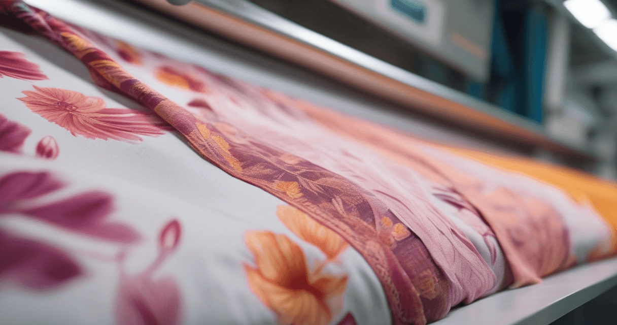
Turning a flat print into a 3D fabric mockup is how you make a design feel like cloth instead of a graphic. A flat swatch tells a client what the pattern is; a 3D mockup tells them what the fabric would feel like in the hand, with folds catching light, emboss lifting the motif and drape suggesting weight. For lookbooks, hero images and social posts, that tactile quality is the difference between a design people scroll past and one they stop on.
The technique is straightforward once you know the four looks it produces and how to control the one setting that matters most: depth. Push depth too far and the fabric looks inflated; keep it restrained and even a fast render passes for a studio shot.
It is worth being honest about what this is and is not. A 3D fabric effect is a fast, image-based illusion of depth, not a full physics simulation with real cloth dynamics. That is a feature, not a limitation, for the job it is built for. A production 3D pipeline with cloth solvers is powerful but slow, and it is overkill when all you need is a beautiful hero image that reads as fabric. The 3D effect gives you ninety percent of the visual payoff in a fraction of the time, which is exactly the trade a busy designer wants when they are producing a lookbook or populating a product page, not engineering a garment. Reach for the heavy 3D pipeline when you genuinely need accurate drape physics; reach for the effect when you need an image that sells.
What a 3D effect actually does
Internally, a 3D fabric effect does what 3D artists do manually: it takes a flat textured surface and adds relief and directional light so the contours read as dimensional. Drop a patterned plane over a curved shape, let light and shadow fall along the folds, and the eye reads real cloth. The tool automates that, applying simulated depth and lighting to your print without any manual 3D work.
- Relief lifts parts of the motif off the surface.
- Folds and drape bend the fabric as if hung or laid down.
- Directional light adds the highlights and shadows that make depth believable.
The reason this works is that human vision reads depth almost entirely from light. We do not see the third dimension directly; we infer it from where shadows fall and where highlights catch. A flat print has no shadows, so the eye correctly reads it as flat. Introduce even a modest, consistent shadow along a fold and the same print suddenly reads as cloth with weight. That is why the effect can be so convincing with so little: it is not adding real geometry, it is adding the light cues your visual system uses to reconstruct geometry on its own.
Step 1: Pick the right 3D look
Four effects cover almost every textile need. Choosing the right one means matching the effect to how the real fabric behaves.
| Effect | What it simulates | Best for |
|---|---|---|
| Embossed | Motif raised slightly off the surface | Jacquard, brocade and woven-in patterns |
| Folded | Crisp creases as if the cloth is laid or stacked | Swatch presentations and folded product shots |
| Draped | Soft flowing folds like hanging fabric | Scarves, dresses and flowing garments |
| Quilted | Puffed, stitched grid of a padded textile | Home textiles, outerwear and padded goods |
If you are unsure, start with drape for apparel and emboss for anything that should look woven-in rather than printed on.
The choice is not purely aesthetic; it is a claim about the fabric. Emboss implies a woven-in or jacquard construction where the pattern is part of the cloth structure, so it suits brocades, damasks and textured wovens. Drape implies a soft, flowing hand and belongs on prints headed for scarves, dresses and anything that hangs. Quilt implies padding and stitching, which is why it only makes sense for outerwear, bedding and home goods. Choose the effect that matches the fabric you actually intend to make, and the mockup tells the truth. Choose one that contradicts the intended fabric and you have made a pretty image that misleads the client.
Step 2: Start from clean artwork
Relief effects follow the contrast in your design. Sharp, high-contrast edges emboss and fold convincingly; muddy, low-contrast art produces vague, mushy depth. Preparation is the same discipline you would use before any advanced treatment.
- Work at full resolution so the relief stays crisp when scaled.
- Boost motif-to-ground separation so edges are unambiguous.
- Remove noise so the effect does not raise stray specks into fake texture.
If your print is a repeat, make it seamless first with our guide on how to create seamless textile patterns so folds do not reveal a visible seam.
Contrast is the ingredient that matters most, because the effect reads your design like a height map: lighter and darker areas become higher and lower relief. A design with strong, deliberate contrast produces clean, purposeful depth where you intended it. A washed-out design with everything at mid-tone gives the effect nothing to grip, and you get vague, uniform lumpiness instead of crisp emboss. If your art is soft by nature, that is fine, but boost the separation of the elements you want to lift before you apply the effect, so the relief lands on the shapes you chose rather than on random tonal drift.
Step 3: Control the depth
Depth is the single control that separates a believable mockup from a plastic one. It sets how pronounced the relief and folds are.
- Start low. Begin with light depth and raise it gradually.
- Stop when folds read clearly. The moment the emboss or drape is obvious, hold there.
- Avoid the inflated look. Maximum depth makes fabric look puffed and artificial.
| Depth level | Result | Use when |
|---|---|---|
| Low | Subtle relief, mostly flat | Fine prints where legibility matters |
| Moderate | Clear folds and emboss, still natural | Most lookbook and hero images |
| High | Strong, sculptural relief | Deliberately dramatic, stylized shots only |
Step 4: Mind the color
A 3D effect adds shadows in creases and highlights on raised areas, so the perceived color varies across the piece even though the underlying hue does not change. Treat the render as a mood image, not a color proof.
- Lock your palette first. Fix color before applying depth using our Pantone TCX matching guide.
- Know the screen shift. Review CMYK vs sRGB color shift so you are not fooled by monitor color.
- Keep a flat reference. Always keep a flat, evenly lit version for actual color approval.
Step 5: When to use 3D versus flat
3D and flat presentations serve different jobs. Reach for 3D when you are selling a feeling and flat when you are confirming a fact.
- Use 3D for lookbooks, hero banners, social content and pitch decks where tactility sells.
- Use flat for repeat checks, color approval and technical review, where accuracy beats drama.
- Use both in a single deck: a 3D hero to grab attention, a flat detail to prove the print.
For a full garment context rather than a fabric close-up, combine this with our guide on making a realistic fabric mockup for clients, which puts your print on a whole product.
Step 6: Where 3D previews earn their keep
Some placements benefit from depth far more than others. Knowing where a 3D effect pays off keeps you from applying it everywhere out of habit.
- Lookbook spreads. A draped or embossed hero image gives a lookbook the tactile, editorial feel that flat swatches never manage.
- E-commerce hero shots. The first image on a product page has one job, to make someone want to touch the fabric, and depth does that.
- Social and pitch decks. Depth stops the scroll and reads as premium, which matters when you are competing for attention in a feed or a room.
- Texture-led designs. Jacquard, brocade and quilted concepts barely exist as flat art; the 3D effect is what communicates the whole idea.
By contrast, a repeat you are sending to a mill for approval, a color card, or a technical spec sheet all want flatness and accuracy. The rule of thumb holds: 3D to sell the feeling, flat to prove the fact.
A practical way to think about it is to imagine who is looking at the image and what decision they are about to make. A buyer deciding whether they want the fabric is making an emotional, tactile call, and depth helps them make it. A production manager deciding whether the repeat lines up is making a technical call, and depth only gets in the way. Match the presentation to the decision. When both audiences will see the same deck, give each what it needs: a draped, embossed hero to win the room, followed by a clean flat detail so nobody has to squint through shadows to check the pattern. That pairing respects both the sale and the spec.
What to read next
Pair depth with a full-garment view in how to make a realistic fabric mockup for clients, add a true woven texture with previewing your print on denim, linen and twill, and lock your color using the Pantone TCX matching guide before you render. When you are ready to add dimension to your print, open the Texloom Studio and load your artwork into the 3D effect tool.