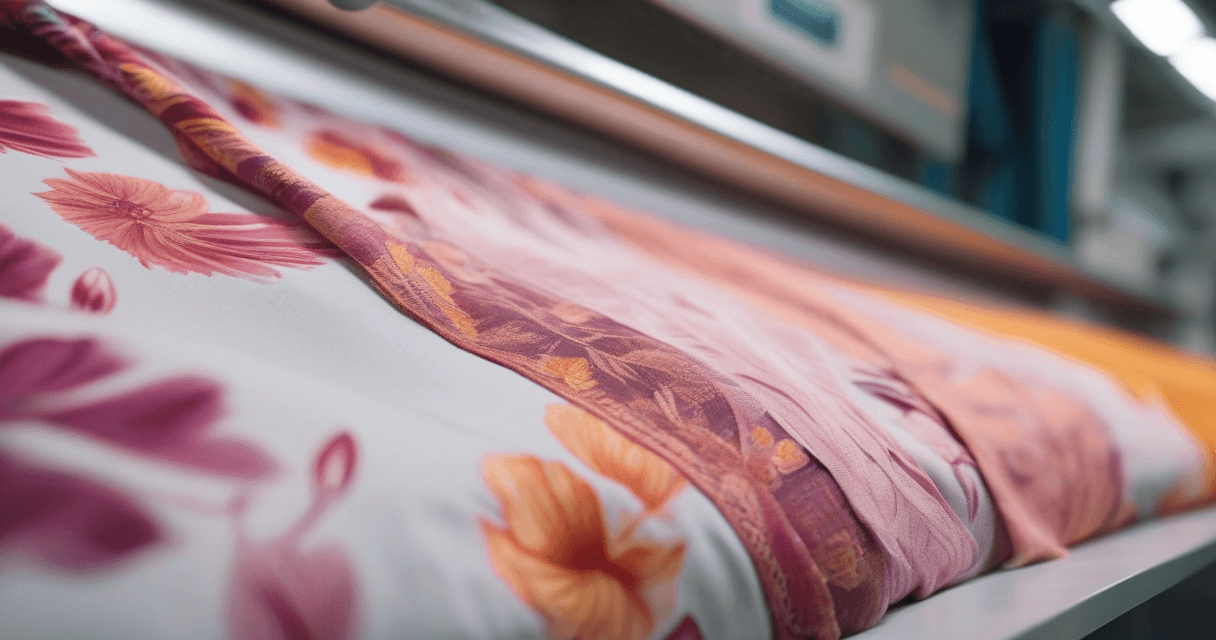
A realistic fabric mockup is the difference between a client squinting at a flat swatch and a client seeing their finished product. Instead of asking someone to imagine your print on a saree, dress or cushion, a mockup shows it there, wrapped around real folds with believable lighting. It sells the design in the pitch and doubles as ready-to-use imagery for e-commerce listings, all without a single sample being sewn or a photographer being booked.
The good news is that convincing mockups come down to a handful of controllable factors. Get scale, folds, lighting and color right and even a fast render reads as a real product photo.
What a mockup actually does
A mockup takes your flat, two-dimensional print and maps it onto a three-dimensional garment shape. The best tools do three things at once:
- Wrap the print around the garment so it follows folds and drape instead of sitting flat.
- Add lighting with soft shadows and highlights that reveal the fabric's weight and shape.
- Preserve color so the hue on screen matches the dye you intend.
Done well, this replaces two expensive things during the pitch stage: physical samples and studio photoshoots. You can validate a design, show colorways and build a catalog before committing any budget to production.
It is worth being clear about what a mockup is not. It is not a color proof, because monitors and dyes never agree perfectly, and it is not a fit sample, because it cannot tell you how a garment sews or hangs on a real body. What it is, and what it does better than almost anything else at the concept stage, is answer the question every client actually asks first: what will this look like as a finished thing? A flat swatch forces them to imagine that; a good mockup removes the guesswork, and removing guesswork is what closes approvals.
Step 1: Choose the right product
Match the product to the story you are telling. A saree mockup shows off drape and repeat placement; a cushion shows a print squared up and centered; a dress shows how a motif moves across a body. Pick the garment that flatters your print and matches the client's market.
| Product | What it showcases | Best for |
|---|---|---|
| Saree or scarf | Drape, flow and repeat across a long panel | Flowing prints and border designs |
| Dress or garment | How the motif reads on a worn silhouette | Apparel and fashion pitches |
| Cushion or home item | Squared, centered placement of a repeat | Home textiles and surface pattern |
The instinct to show a print on every possible product at once is understandable, but a pitch is stronger when the hero image is the single garment that flatters the design most. Lead with that, then support it with a small range. A flowing large-scale floral belongs on a saree or dress where it can breathe; a tight geometric belongs on a cushion where the repeat squares up cleanly. Matching the print to the product is the first design decision, not an afterthought.
Step 2: Prepare a high-resolution print
The mockup has to stretch and warp your print over curves, so resolution matters more than it does for a flat presentation. Low-resolution art goes soft or pixelated the moment it wraps around a fold.
- Start large. Use the highest-resolution version of your artwork you have.
- Make it seamless if it repeats. A tiling print should not show a visible seam across the garment. See how to create seamless textile patterns.
- Fix color first. Correct your palette before the mockup, because a color shift here shows up on every product you generate.
Resolution is the quiet difference between a mockup that survives a zoom and one that falls apart under scrutiny. A client viewing a pitch deck on a large screen, or a shopper tapping to enlarge a product photo, will get close enough to expose soft edges. Because the mockup has to warp your art around curves, it effectively magnifies parts of the print where the fabric stretches over a shoulder or a fold. Feed it low-resolution art and those stretched regions turn mushy exactly where the eye lingers. Start from the largest, cleanest version of your artwork you have, and if it is a small file, it is worth upscaling it before you mock it up rather than after.
Step 3: Get the scale right
Scale is the mistake clients notice first. A floral that looks perfect on screen can render as either wallpaper-huge or invisibly tiny once it is on an actual dress. Think in real-world centimeters: how big is one motif on the finished product?
- Reference a real garment. Picture the motif next to a hand or a seam to judge its true size.
- Test two or three scales. Generate the mockup at a few sizes and compare before deciding.
- Mind the repeat density. Too dense and detail is lost; too sparse and the fabric looks empty.
A quick sanity check that catches most scale errors: decide how many full motifs you want to appear across the width of the garment, then work backward. If you want roughly five repeats across the front of a dress, and the mockup shows two enormous ones, your print is scaled far too large. This is easier to judge on the mockup than on the flat art, which is exactly why previewing before production matters. Getting scale wrong is not a cosmetic issue; a print sized for a scarf will look completely different sized for upholstery, and clients notice immediately.
Step 4: Sell it with folds and lighting
This is where a mockup either convinces or collapses. As the search-and-mockup community consistently notes, lighting can make or break a render: soft shadows and reflections indicate the garment's shape and fabric weight, while flat, even light reads as pasted-on graphic.
- Let the print follow folds. The design should bend and shade where the fabric creases, not sit flat on top.
- Keep shadows soft. Hard-edged shadows look like a cutout; gentle gradients look like cloth.
- Add believable highlights. A subtle sheen tells the eye whether it is looking at silk, cotton or fleece.
If you want the fabric itself to read as a specific weave, such as denim or linen, layer a weave simulation before the mockup. Our guide on previewing your print on denim, linen and twill covers that step.
Step 5: Keep the color honest
A gorgeous mockup with the wrong color is worse than useless, because the client approves a hue that production cannot hit. Screens and dyes do not speak the same language, and colors shift between them.
- Understand the shift. Read CMYK vs sRGB color shift in textiles to see why on-screen color drifts.
- Anchor to a standard. Tie key colors to Pantone TCX so the mockup reflects a real dye target, per our Pantone TCX color matching guide.
- State the caveat. Tell clients the mockup is a close preview and the physical sample is the final color word.
Step 6: Multiply one print into a range
Once one mockup looks right, reuse the same print across several products. Showing a single design on a dress, a cushion and a scarf demonstrates commercial range in seconds and, for e-commerce, populates multiple listings from one piece of artwork.
- Use transparent or clean backgrounds so a catalog looks consistent.
- Keep lighting direction consistent across the set so the images feel like one shoot.
- Export at listing resolution so images stay crisp when a buyer zooms in.
Step 7: A pre-send checklist
Before a mockup goes to a client or a product page, run it past a short list. These are the details that separate a professional preview from an obviously synthetic one.
| Check | What to look for |
|---|---|
| Scale | Motif size looks natural for the real garment, not wallpaper-huge or invisible |
| Folds | Print bends and shades in creases instead of sitting flat |
| Lighting | Soft shadows and highlights read the fabric weight; no flat, even light |
| Seam | No visible repeat seam breaking across the garment |
| Color | Hue matches your intended dye target, with the caveat stated to the client |
| Resolution | Edges stay crisp at listing zoom, no softness or pixelation |
If every row passes, the mockup is doing its job: it looks like a photograph of a real product, and it lets the client decide on the design rather than on the quality of the render.
One last habit pays off over a career: keep your best-performing mockup setups as reusable templates. Once you find a garment, lighting angle and background that make your work look its best, reuse them across a collection so every image shares a house style. Buyers and clients respond to consistency; a catalog where every product sits in the same light and the same clean context reads as a considered brand, while a jumble of mismatched renders reads as amateur. The individual mockup sells one design, but a consistent set of them sells you.
What to read next
To push realism further, add a woven texture with our guide on previewing your print on denim, linen and twill, or add depth with turning a flat print into a 3D fabric mockup. Lock your color first using the Pantone TCX matching guide. When you are ready to place your print on a real garment shape, open the Texloom Studio and load your artwork into the mockup tool.