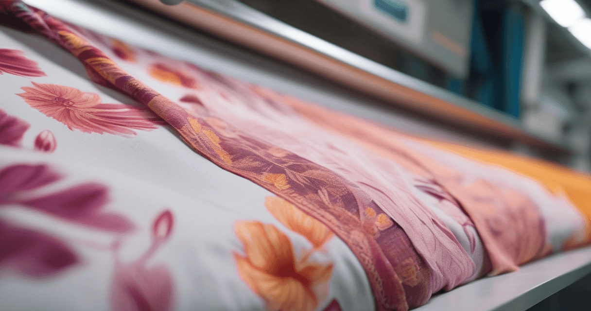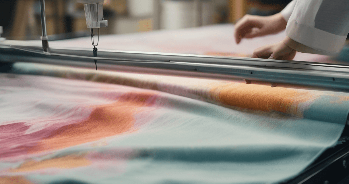
Previewing your print on denim, linen and twill before production is how you avoid the expensive surprise of a design that looked perfect on screen and fell apart on cloth. A fabric weave simulator overlays a real woven structure onto your flat artwork, so instead of judging the print on a blank white ground you see it interacting with the actual texture, sheen and irregularity of the fabric you plan to use. Fine lines that vanish on linen, motifs that fight the twill grain, colors that shift against an indigo denim ground; the simulator surfaces all of it while fixing it is still free.
To read a weave preview well, you need to understand what each weave actually does to a surface. That structure, more than color, is what changes how your pattern reads.
The stakes are practical and financial. A strike-off, the small trial run a mill produces to prove a color and print before bulk, costs money and time, and every round you burn on a problem you could have caught digitally is waste. Designers who preview the weave first tend to arrive at their strike-off with a design that already accounts for the fabric, so they need fewer rounds and hit production faster. Designers who skip the step discover on physical cloth that their delicate line work vanished into a slub, and they pay for the lesson twice, once in the failed strike-off and once in the redesign.
Why the weave changes your print
A print never sits on a neutral plane in the real world. It sits on interlaced yarn, and the way those yarns cross determines the surface. A smooth weave leaves your design almost untouched; a textured or directional weave reshapes how every motif reads. Simulating that before you sample is the whole point.
- Texture breaks up fine lines and softens detail.
- Direction adds a grain that can subtly angle your motifs.
- Sheen and depth change how flat colors appear on the cloth.
Digital designers hit this wall constantly because they work on backlit screens showing perfectly flat, uniform pixels. The design looks immaculate because the medium is immaculate. Cloth is nothing like that. It is a physical grid of interlaced yarn with its own micro-shadows, sheen and irregularity, and it imposes all of that onto whatever you print on it. A weave simulator is really a reality check: it drops your pristine screen design onto the messy physical grid it will actually live on, so you find out now, not after a strike-off, whether the two get along.
Step 1: Know your weaves
Three weave families cover most of what a print designer will simulate. Each behaves differently, and the differences are consistent enough to plan around.
| Weave | Structure | Effect on your print |
|---|---|---|
| Plain (poplin) | Warp and weft interlace one over one | Smooth, even ground; minimal interference with detail |
| Twill (denim, chino) | Weft passes over one, under two-plus, offset each row | Diagonal rib adds directional grain and subtle line break-up |
| Linen | Plain weave with irregular, slubby flax yarn | Visible slubs soften fine detail and add organic texture |
The defining feature of twill is its diagonal rib, formed because each row of weft steps over by one, creating the characteristic twill line you see in denim and chino. Denim adds its own signature: indigo-dyed warp against undyed weft, giving the ground a depth a flat preview cannot capture.
Step 2: Understand denim specifically
Denim deserves its own note because it is the most common twill designers simulate, and it changes a print more than people expect.
- The diagonal grain interacts with your motifs, so check that horizontal or vertical lines do not fight the twill direction.
- The indigo ground darkens and cools your colors, especially light tones.
- Directionality matters. Right-hand and left-hand twill run their diagonal opposite ways, which can subtly change the feel of a symmetrical motif.
There is a reason denim is worth calling out on its own. It is arguably the most-produced twill in the world, and its indigo-and-white construction means the ground is never a neutral canvas. A pale motif that pops on a white screen can sink into a mid-blue denim ground and lose most of its contrast. Warm colors in particular cool down against indigo. If you are designing for denim specifically, simulate early and often, and expect to push your motif contrast higher than you would for a print on white cotton. The simulation shows you the fight between your palette and the ground before it costs you a sample.
Step 3: Watch fine detail on linen
Linen is a plain weave, but its irregular, slubby flax yarn makes it behave nothing like smooth poplin. Those slubs are the whole character of linen, and they are also what eats fine detail.
- Simplify small motifs. Hairline detail can disappear into the slub texture.
- Lean into the organic feel. Loose, painterly prints suit linen; precise geometrics can look fought.
- Check contrast. Low-contrast detail is the first thing to vanish on a textured ground.
Step 4: Read the simulation correctly
A weave preview is only useful if you interpret it at the right scale. The relationship between weave size and motif size is what determines legibility.
- Preview at true scale. Match the weave and motif to real-world size so the ratio is honest.
- Zoom to detail level. Inspect the smallest important element against the texture.
- Judge legibility, not beauty. The question is whether the print still reads, not whether the render is pretty.
If the simulation shows fine detail breaking up, you have two choices: simplify the artwork or move to a smoother weave. Both are far cheaper to decide now than after a strike-off.
Step 5: Combine weave with a mockup
A weave simulation shows the fabric surface; a garment mockup shows the whole product. Used together they give a complete production preview.
- Simulate the weave first to confirm the texture works with your print.
- Then apply a mockup to see it on a real garment shape, per our guide on making a realistic fabric mockup for clients.
- Add depth if needed using turning a flat print into a 3D fabric mockup for lookbook-grade images.
The order matters. Simulating the weave first is a technical decision about legibility and color, made in isolation so you are not distracted by drape or styling. Only once the print survives the weave do you invest effort in the mockup and 3D presentation, because there is no point making a beautiful garment render of a design that will not read on the cloth. Treat the weave check as a gate the design has to pass before it earns the polish.
Step 6: Jacquard and complex wovens
Beyond the everyday three, more complex constructions change a print even more dramatically, and they are worth previewing when your production plan calls for them.
- Jacquard weaves patterns directly into the cloth on a special loom, so a print laid over a jacquard ground competes with woven-in structure. Tight, detailed artwork can clash; bolder motifs coexist better.
- Satin floats yarns to create a smooth, reflective face, which lifts color saturation and sheen but shows every flaw in fine detail.
- Heavy canvas and duck weaves add coarse texture that suits robust, graphic prints and punishes hairline work.
The principle stays the same across all of them: the more structure the weave has, the more it competes with your artwork, and the more valuable it is to preview before you commit. For any of these, the smoother plain weaves remain your safe harbor for detailed work.
Step 7: When to confirm with a physical sample
A simulation is a preview, not a promise. It catches the obvious failures early and cuts your sampling rounds, but physical cloth has its own hand, sheen and dye behavior. Before a big production run, still confirm your winning combination with a physical strike-off, and prepare your file properly first.
- Finalize color against a real dye target using our Pantone TCX matching guide.
- Prep the artwork with the 2026 artwork preparation guide.
- Order a strike-off in the actual fabric to confirm hand and color.
Think of the whole sequence as a funnel that gets progressively more expensive. Weave simulation is free and fast, so you run it on every candidate. Digital mockups and 3D renders cost a little more effort, so you apply them to the survivors. A physical strike-off costs real money and lead time, so you order it only for the finalists. By filtering out the obvious failures at the cheap end, you make sure the expensive physical samples are spent on designs that have already proven they work on the target cloth. That is the entire economic argument for simulating first: it moves your mistakes to the stage where they cost nothing.
What to read next
After confirming the weave works, place your print on a full garment with how to make a realistic fabric mockup for clients, add dimension using turning a flat print into a 3D fabric mockup, and finalize color with the Pantone TCX matching guide. When you are ready to see your design on a real woven texture, open the Texloom Studio and load your print into the weave tool.